I started my career analyzing real estate data at one of the most influential financial institutions in the world. I found, cleaned, interpreted, and analyzed data. My favorite part of the process, comes at the end – creating an impactful, and colorful, data visualization to tell the story of my findings. Great data visualizations are powerful and I share my thoughts on just how powerful they can be in this article.
My favorite part about visualizing data is that there is always an opportunity to create something new.
While data collection, cleaning, and analysis have some wiggle room for how the jobs get done, the ultimate goal will always be the same – find validated and accurate data, remove outliers, adjust data types, appropriately restructure the data, and run statistical analyses based on tried and true methodologies.
But the data visualization and the story that you tell with the results is where the magic really happens. This answers the question “so what?” to why you began researching this topic in the first place. The graphical representation allows you to combine your expertise and experience with the objective results of the data.
Challenge the status quo
Both professionally and beyond, I challenge the status quo way of thinking or problem-solving. I have heard many times “we do it this way, because we always have” and actively combat that complacency by finding innovative approaches and solutions to what we are currently facing. My goal isn’t to change for the sake of change, and I don’t always have the “right” answer, but what I do try to influence is a way of thinking that opens up more possibilities. This broader perspective that I hold translates to how I personally develop visualizations and graphics for the work I produce. There is no one size fits all approach or final result.
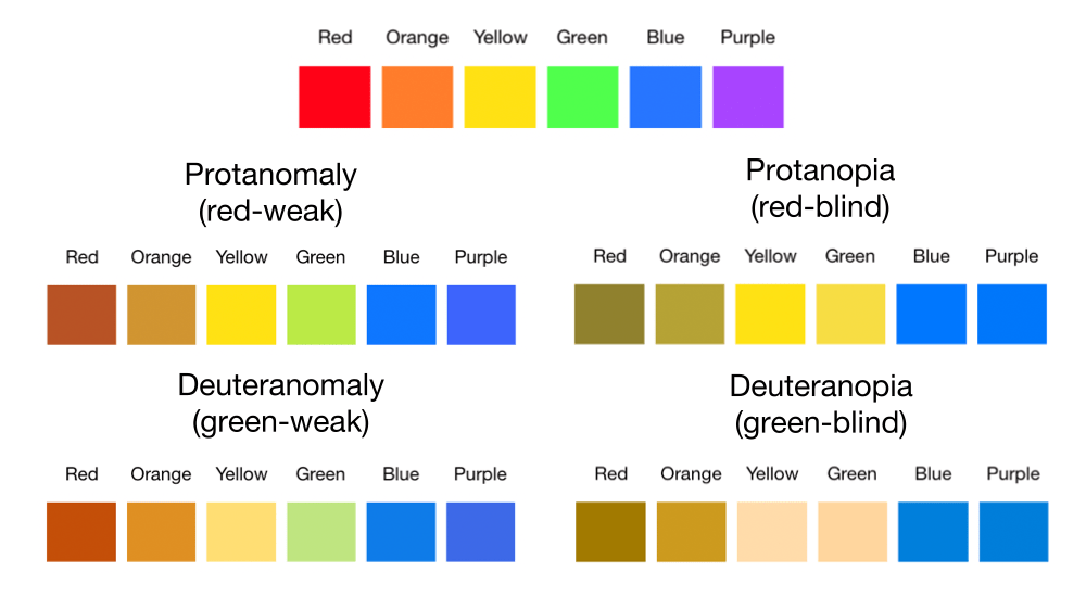
In addition to creating the story and visuals that seamlessly reflect the information to be shown, I LOVE using color as a powerful tool in my creations. An important element to keep in mind is to create visually pleasing graphics that are also color-blind friendly. I think it’s important for all who are able to see the graphic have a pleasant experience in doing so.
Keep the end-use in mind
I have produced data visualizations in a variety of tools, including Microsoft Excel, the programming language R, the data visualization software Tableau, and in presentation decks where there may be manual elements, but there is greater freedom in what type of graphic I produce. Each tool has its unique approach and process to developing visualizations that are valuable in their own way. When selecting a tool to build a visualization, it’s always important to understand how the information will be shared. For example, if you use Tableau Server (which allows you to publish your Tableau workbook, which is then shareable via a web link), you are able to share that work with anyone with access to that server. Alternatively, I have given a number of presentations where everything was compiled in PowerPoint slides that were sent to the conference coordinator ahead of time. In these cases, I may compile my visuals from a multitude of these sources, and include static images in the final deck I discuss.
I believe the single most powerful tool of a great data visualization is its ability to influence.
When you’ve done your homework and know that the messaging is clear (and not contradictory or confusing), the visual impact of a well designed graphic can be that of a picture. We have all heard the phrase “a picture is worth 1000 words.” Imagine creating some thing with that type of impact. Well-presented impact and clarity are particularly important in the cases where you aren’t directly presenting this information to your audience. Influential data visualizations can connect with the viewers’ emotions, potentially eliciting a spark that eventually grows into action – if that is the intent of your work.
Let’s look at a simple example
I will share more about my keen interest in personal finance in other articles, but here is an example of what I may create to help me reach a savings goal. In particular, I am very excited about reaching this goal, so I’d like to create something that will entice me to save more.
Assume the following situation for my income and expenses in a given month:
- Income: $3500 (after-tax take-home pay)
- Expenses: $2400 (this covers necessities like food and housing)
- Optional expenses: $600 (includes things I want to have, such as a gym membership and a Spotify subscription)
- Savings: $500 (everything remaining)
I compiled three saving options for myself, which comes from manipulating my “optional expenses” category.
- Save $500/month, keeping my optional expenses as is.
- Save $700/month, reducing my optional expenses by $200/month.
- Save $900/month, reducing my optional expenses by $400/month.
I used Google Sheets (not even Microsoft Excel) to compile both of my visualizations.
The first, basic visualization shows my three savings options and the amount of time it will take to reach my goal for each savings rate. Remember, I am trying to entice myself to save as quickly as I can, so there is both a financial and a time element I am focused on.
I made minimal changes to the default graphic in the program, only changing the color of option 3 (which gets me to my goal the fastest) to red so it stood out and adding the month label to the graph.
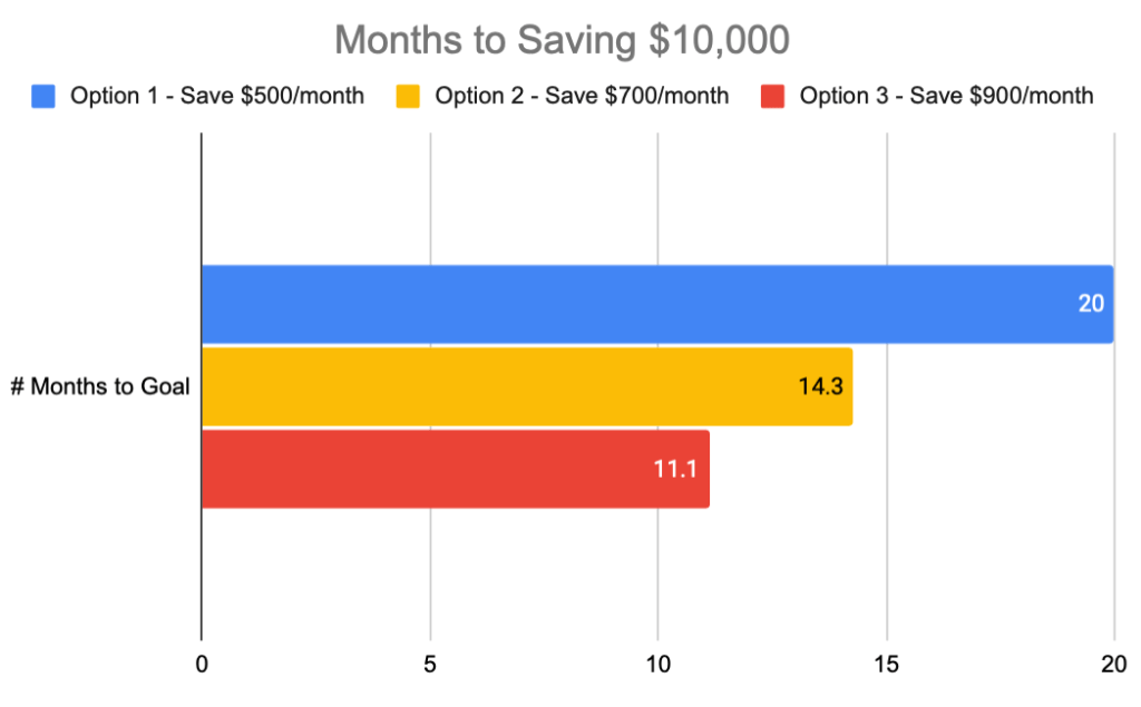
In the visual above, it’s clear to see the higher saving rate leads me to my goal the fastest. This shows what I intuitively know and isn’t very impactful. Let’s take a different approach.
The economist in me notes that the opportunity cost of the three timelines is what is impactful. Assuming the additional saving between the three options doesn’t significantly impact my standard of living, we can focus on what can be done over the same 20 months (longest time horizon) if I pursue the most aggressive saving option.
To keep the example centered on financials and similar formatting, I modified the visual above to show how much total saving is possible over the entire 20-month time horizon. The lighter shaded section shows the Additional Savings I could have if I returned to my normal savings rate of $500 per month after I reach my $10,000 goal.
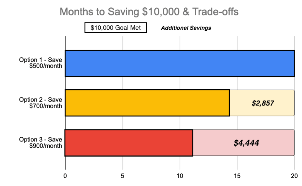
I can quickly see that with option 3, I hit my savings goal in just under a year and can continue with my normal $500 per month savings rate to have almost $4,500 more at the end of 20 months than saving $500 per month for the entire 20 months. That is a big difference!
While I maintained the same basic formatting, these enhancements and reframing of the data tell a different story than the first visual. I can clearly see how much money I could leave on the table over the next 20 months by NOT saving more aggressively now. The desire to take action now and save more was exactly the intent of this graphic!
Conclusion
It’s easy to create data visualizations that depict what we intuitively know – saving more money each month will take me fewer months to reach a target. But with creativity and purpose, we can develop impactful visualizations that can influence others to take action or consider new ideas. Happy visualizing!

Leave a comment